I sketched a wave tattoo for beach days. On paper, it looked bold. But pictured on my chest with swim trunks, it felt lopsided—too wide, swallowed by my frame.
I've redone designs that bunched up awkwardly or washed out in sunlight.
That off-balance pull when you're half-dressed at the shore?
It's fixable.
How To Design Stylish Mens Beach Tattoos
This method helps me create tattoos that sit right on the body at the beach. You'll get a design that's proportional, visible in swim gear, and feels natural in motion. No guesswork—just balanced results every time.
What You’ll Need
- spiral sketchbook with thick paper for tattoo outlines
- set of fine-tip black pens for clean lines
- colored pencils in ocean blues and neutrals
- washable skin-safe markers for testing
- soft measuring tape for body proportions
- full-length mirror for real poses
- tattoo stencil transfer paper
- high-SPF clear sunscreen gel
Step 1: Map Your Body's Lines First
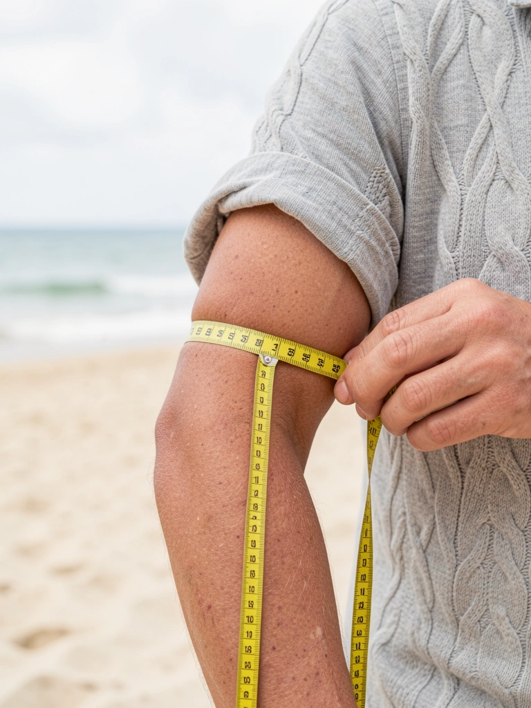
I start by standing in front of the mirror in swim trunks. I run the measuring tape along my arm or chest, noting curves and muscle lines. This sets the canvas—like checking how pants hit your waist.
Visually, faint tape marks show where the design will flow, not fight, your shape.
People miss how shoulders taper; designs flop there without this.
Avoid straight horizontal lines—they cut the body short. Trace natural bends instead.
It grounds the tattoo, making it feel like part of you at the beach.
Step 2: Sketch a Simple Core Shape

With pencil first, I draw one bold shape—like a wave or anchor—that matches my body map. Keep it 20% of the area; bigger looks heavy in low light.
The page shifts from blank to anchored, mirroring how it'll hug your skin.
Missed insight: beach motion needs flow—rigid shapes stiffen when you move.
Don't cram edges; leave breathing room or it crowds swim lines.
This core holds everything, balanced like a solid base layer.
Step 3: Layer Details for Depth, Not Bulk
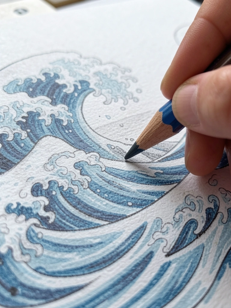
I add subtle lines and shading next, using blues for water feel. Test weight by flipping the sketch—does it read from afar?
Now the design pops with dimension, like fabric catching light on skin.
Folks overlook fade risk; sun bleaches thin details fast.
Skip tiny script—it blurs on tanned skin. Stick to bold accents.
It builds intention without overload, wearable in waves.
Step 4: Test on Skin in Beach Pose
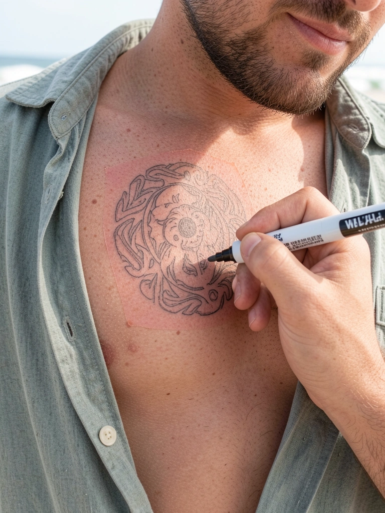
Marker in hand, I trace the sketch onto skin, posing as I would at the beach—arms up, torso turned. Mirror check every angle.
The temporary ink reveals true scale; it shrinks or stretches right there.
Key miss: static sketches ignore bend—test in motion.
Don't rush; wipe and resize if it warps on flex.
This confirms fit, like trying on before committing.
Step 5: Adjust for Light and Skin Tone

I rub sunscreen over the test, watching how light hits. Darken outlines if your tone pulls color.
Final tweaks make it crisp in sun, balanced against sand and water.
Overlooked: warm tones need cooler inks to balance heat.
Avoid pastels—they vanish outdoors. Go mid-tone for staying power.
Now it's beach-ready, feeling right.
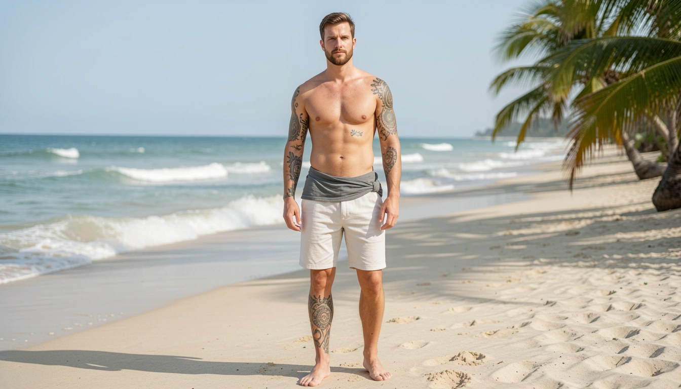
Placement That Works with Beach Gear
Arms and chests show best in trunks. I place waves curving shoulder to pec—it follows swim motion without peeking odd under rash guards.
- Outer forearm: visible, easy cover.
- Rib side: subtle flex show.
Avoid neck—hats snag.
Thighs pair with boardshorts, grounded not floating.
Colors Built for Sun
Blues hold in UV; I mix navy with sandy beige. Test with markers outdoors.
They shift less than reds, staying clean post-swim.
- Navy: depth without fade.
- Teal: water pop.
Neutrals anchor, comfortable all day.
Fixes for Off Designs
I've blurred busy ones. Simplify: one focal point rules.
- Too small? Doubles faint in tan lines.
- Clashing? Match skin warmth first.
Balance trumps trends—your body decides.
Final Thoughts
Start with one arm test. You'll see how proportion clicks.
These designs feel settled, not forced.
Grab your sketchbook this weekend.
Beach skin waits—make it yours.
Leave a Reply